Wednesday, October 31, 2012

Week #10

KIT HINRICHS


 This is designed by acclaimed graphic designer Kit Hinrich's and his team at Studio Hinrichs. It is the 365 Typography Calendar which features twelve unique typefaces, with descriptions of the type and a biography of each designer. All major holidays are noted on the calendar, along with the birthdays of the type designers.


Week #8

I was especially inspired by this piece. It reminds me a lot of my poster project. I love how the type is used and distorted to fit into the continents. It also makes a statement. Russia seems so overpowering.
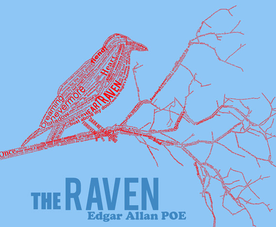
I also love this picture made from type. The image is made from Edgar Allan Poe's "The Raven" which I remember reading in middle school. I like the emphasis on some main words that pop out to me from the poem such as: "Nevermore" and "Dreaming."

Week #9

 SPELL CHECK! Huge no-no! Always drop the "e" and add "ing." Grammar school. I do not understand how people can make these major mistakes that just make their business look bad.
I do not like this piece of typography. I cannot read what it says. I can make out some kind of records in the "o's" and "0's." I would consider this a bad piece of typography.

Week #7

 
I really enjoy this piece of typography. I think the use of space was very successful. Making the female figure blank, with the other character formed with words he'd like to say to her. The words that are falling say, "my words just crumble as they leave me... never ever to reach you." The way the words fall out of his mouth right before they reach her is very beautiful.

This sin piece of work is extremely interesting. I like how the letters that spell "sin" form the word. I also like how they fall toward "hell" in a way that connects sinning to the devil.

Week #6

AWESOME TYPOGRAPHY EXAMPLES

I really enjoy this piece of typography. I always loved the sayong "When life hands you lemons make lemonade." However this piece takes the quote to another level. It continues to say "When life gives you lemons keep the seeds." Athough, I did notice a spell check which then through me off.

Friday, October 12, 2012

Week #5

These pieces really make a statement. I especially enjoy the Obama picture. Although it is entirely made out of text, the artist used color tones to create form. I also like the connection of the words to what he has going on in his presidency.


Week #4


TSHIRT IN PROGRESS CRITIQUE


Friday, October 5, 2012

Week #3

 I really enjoy this use of font. I like how it incorporated the theme of the photo. It combines the anchor in the water and rope with the saying "find your anchor".
I also like this piece in that it reminds of me of wood blocks. With all the letters placed as they are still make the saying legible. I also like the stretching and distorting of the letters.

T-Shirt Sketches