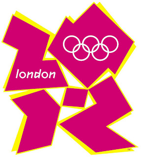
The 2012 London Games logo is by far the most controversial and in my opinion terrible designs to date by the Olympics. The name of this font is "2012 Headline"combining Greek stone letters with geometric graffiti or street art. There are no curves and majority of the letters are angular in form. I find it, in a way, as outdated and barely legible. The "2" can be easily mistaken for a "Z". I have noticed that every Olympic logo in the past usually pays some kind of homage in the image to the country to which they are held. This in no way represents London to me. I also find the colors unappealing.
Another terrible example of bad typography is this invitation for Kevin Federline's 30th birthday "bash". The huge and obnoxious 30 looks like it came out of some mid-evil time poster or pamphlet. Followed by a cursive, twirly, girly "birthday bash" underneath. There are 5-6 different fonts on this invitation in 5-6 different sizes. It is simply just too much.


