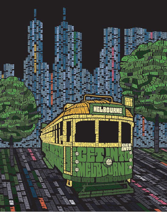
Vodafone has a very cool ad campaign that displays typography in a
very unique way. Every ad is almost completely designed with letters with a
few exceptions, which I think is very difficult and creative to compose.
The use of colors is also great in each ad as they create great harmony
for the illustrations. The use of letters works with Vodafone concept
of “Talk About It More” in their campaign. The overall appeal of the
campaign is the artisticness of the ads.


I love this piece of type. The connection between the content and the message is awesome. It is a great use of a PSA.


No comments:
Post a Comment